Colours are a significant contributor to brand recognition and form a vital component to a brand identity. They have the inherent capacity to communicate meaning in an instant, to enhance the our retention and recollection of information. The consistent and particular exposure to colour can trigger memories and associations in the human cognitive system. These qualities make up a persuasive argument to keep colours available for all traders to use for their products, but also a strong reason why some brands may wish to obtain an exclusive right over the colours the public has started to associate with them. The Coca Cola red is considered the company’s second secret formula for success, having been so influential that it (allegedly) re-shaped the image of Santa Claus. The Ferrari red has become known as the colour of racing. In fashion, red is the sole of a shoe designed by Christian Louboutin. Colours are not easy to trade mark but there are circumstances where a trade mark registration may be justified.
The most up to date definition of a trade mark, summarised in the 1994 Trade Mark Act, Section 1(1) (reflecting the changes implemented on 14 January 2019), reads as follows:
“In this Act “trade mark” means any sign which is capable
(a) of being represented in the register in a manner which enables the registrar and other competent authorities and the public to determine the clear and precise subject matter of the protection afforded to the proprietor, and
(b) of distinguishing goods or services of one undertaking from those of other undertakings.
A trade mark may, in particular, consist of words (including personal names), designs, letters, numerals, colours, sounds or the shape of goods or their packaging.”
Any sign
Under UK law there is no category of signs that is strictly excluded from being a trade mark, as long as the sign can perform the key function of a trade mark: differentiate the goods of one trader from these of another.
A COLOUR per se
The Libertel Case (2003) is the settled case law on colour trade marks. It analyses the inherent ability of colours to act as trade marks and notes the following:
“whilst colours are capable of conveying certain associations of ideas, and of arousing feelings, they possess little inherent capacity of communicating specific information”
The court however did not rule out the idea that, as a matter of principle, colours can function as trade marks, and rightly so as the following colours have achieved trade mark status: Barclays’ turquoise blue, Tiffany’s robin egg blue and Owens Corning’s pink.
Representation on the Trade Mark Register
For any sign to be registered as a trade mark it must be represented on the Trade Mark Register in a way that enables anyone accessing the Register to be able to understand what is being protected as a trade mark. The underlying goal is to provide certainty for legal practitioners and market competitors. The Sieckmann Case (2002) provides a seven-fold criteria for the representation of any given sign. The Sieckmann criteria requires that the sign must be represented in a way that is (1) clear, (2) precise, (3) self-contained, (4) easily accessible, (5) intelligible, (6) durable and (7) objective.
Interpretation of the Sieckmann criteria by the courts:
• a sign must always be perceived unambiguously and in the same way – there should be no scope for subjectivity;
• a sign is represented in a self-contained, easily accessible and intelligible manner if any user of the Register without any specific knowledge is able to determine the precise nature of the mark on the basis of the registration alone;
• the representation must be durable e.g. it should not deteriorate with time.
To meet the criteria, a representation of a colour on the Register requires a sample of the colour, accompanied by a verbal description, designating an internationally recognised colour identification code (using colour identification systems such as Pantone, RAL or Focoltone), as illustrated by 3M’s EU Trade Mark registration and Owens Corning’s UK registration below.
Canary Yellow (EUTM) for Post-It notes by 3M with the following representation registered in 2005:
Graphic representation:
Description: The mark consists of the colour Canary Yellow, shown in the attached representation of the mark, as applied to the entire surface of the goods covered by the specification. The standard values (coordinates in the colour space) for the mark are as follows: L = 93.77; a = -5.28; and b = 38.43. The colour references in the Pantone Matching System® that come closest to these specific coordinates in the colour space are Pantone® No. 106 at 60% tint, Pantone® No. 601 at 100% tint, Pantone® No. 101 at 50% tint, and Pantone® No. 100 at 60% tint.
Colour: Canary yellow
Pink (UK TM) for insulating materials by Owens Corning with the following representation registered in 2005:
Graphic representation:
Mark Description: The mark consists of the colour pink (Pantone No.196C) only and with some variegated effect, as shown on the representation on the form of application, as applied to the product insulating material.
Examples of representations that have not met the above mentioned criteria for registration:
1. The Cadbury Case (2014) showed that using vague terms, such the word ‘predominant’, in the description (as shown below) made the representation of the sign unclear and devoid of precision, making its scope of protection uncertain, enabling the applied for sign to take on a multitude of different visual forms.
Description: The colour purple (Pantone 2685C), as shown on the form of application, applied to the whole visible surface, or being the predominant colour applied to the whole visible surface, of the packaging of the goods.
2. The Seven Towns Case (2016), illustrated that if any user of the Register upon seeing the description of the sign would have had to expend “a huge amount of intellectual energy and imagination” in order to understand what the signed consists of, then the representation is not clear and intelligible.
Description: Six surfaces being geometrically arranged in three pairs of parallel surfaces, with each pair being arranged perpendicularly to the other two pairs characterised by: (i) any two adjacent surfaces having different colours and (ii) each such surface having a grid structure formed by black borders dividing the surface into nine equal segments.
COLOUR COMBINATIONS
The Heidelberger Bauchemie Case (2004) interpreted the requirement for trade marks consisting of colour combinations, stipulating that a representation of a combination of colours must be “systematically arranged by associating the colours concerned in a predetermined and uniform way” in order to meet the Sieckmann criteria (noted above). This means that the description of the colour combination in the application for registration must indicate (as well as the internationally recognised colour codes) a systematic arrangement “associating the colours concerned in a predetermined and uniform way”. The court justifies its requirement by noting the following:
“A vague representation would allow numerous different combinations, which would not permit the consumer to perceive and recall a particular combination, thereby enabling him to repeat with certainty the experience of a purchase, any more than they would allow the competent authorities … to know the scope of the protection afforded to the proprietor of the trade mark.”
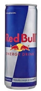
It is due to the above reasoning that Red Bull lost their initial registration for their blue and silver colour trade mark in the EU. The description stating that “the ratio of the colours is approximately 50% – 50%” did not suffice. The use of the word ‘approximately’ made it impossible for all users to interpret the combination of the colours in a uniform and objective way.
Red Bull re-filed in 2019 for the same colour combination but left the description fairly simple, only indicating the colours and the international identification colour codes. The application was accepted for registration. Excluding a more detailed description meant that the scope of protection would be exactly for the combination and arrangement of the colours as they appear in the uploaded graphic representation (shown below). Such a description appears sufficient where a colour mark consists of an arrangement of two (or more) different colours of equal or consistent measures, which would not change if applied to different shapes. The latter position however is likely to vary on a case by case basis.
Blue and Silver (EUTM) for energy drinks by Red Bull registered in 2019:
Graphic representation:
Description: [None]
Colour: (PANTONE:2747C).; (PANTONE:877C).
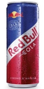
Blue, White and Red (EUTM) for non-alcoholic beverages by Red Bull registered in 2020:
Graphic representation:
Description: [None]
Colour: (PANTONE:2738C).; (PANTONE:200C).; (PANTONE:887C).
The Glaxo Case (2017) considered more complex colour combinations. In the case the court confirm that the visual and verbal representation of a combination of colours are of equal importance and should be read in conjunction in determining what the mark applied for consists of and the weather the representation is clear and precise. The court gave the following theoretical example:
Graphic representation:
Description: The colour green applied to the hood of an agricultural tractor or model agricultural tractor, to the rear wheel mudguards and to the cabin pillars, a silver strip applied to the hood, the colour white applied to the operator’s cab roof, and the colour red applied to the wheel centers.
Colour: A combination of green, red, silver and white.
If the description is not consistent with the image provided, even where the graphic representation is a photograph of the product, the sign will not meet the requirement for clarity and precision.
Acquired Distinctiveness
Unlikeconventionaltrade mark types like word marks and logos, colours are not seen as inherently distinctive to merit a registration. As a result of the exclusionary nature of a trade mark registration, prohibiting unwarranted use of the mark by anyone other than the proprietor of the registration, shown must be that the colour has acquired distinctiveness through continuous and consistent use. The Trade Mark Examiner must be satisfied that the relevant public for the goods or services concerned has come to perceive the colour as an indication of origin, indicating that the goods and services derive from the Applicant for the registration.
Narrow Specification
Colour trade marks tend to cover only a narrow specification of goods or services. This ensures that the Proprietor of a trade mark registration enjoys a monopoly proportionate to the extent of acquired distinctiveness for the applied for colour sign. Acquired distinctiveness must be evidenced for each of the goods or type of service listed in the specification.
Closing Thoughts
Colour trade marks are a valuable addition to any trade mark portfolio. They are difficult to register and require brands to show continuous efforts to educate their demographic, not only to associate the colour with their business, but also to rely on the colour as a guarantor of origin for their goods. With adequate representation on the Register and consistent commercial use, a colour mark can strengthen the recognition of a brand on the market and set it apart from other traders in its industry.


Leave a comment